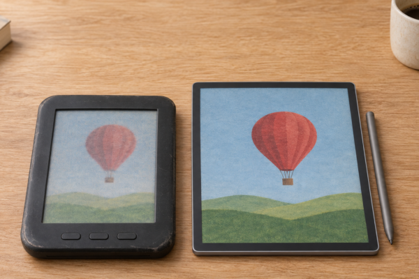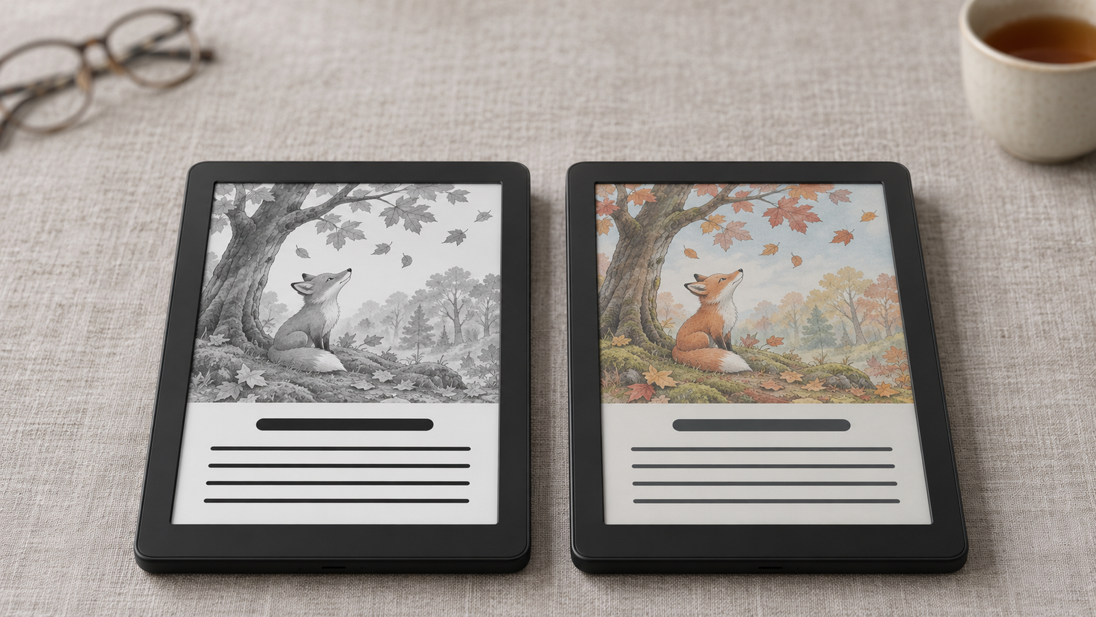
Color seems like an obvious upgrade for an E Ink screen. Who wouldn’t want colorful book covers, illustrated textbooks, maps, and highlighted notes on a display that still looks like paper?
But there’s a catch. Adding color to electronic paper can change the very things that made black-and-white E Ink so appealing: a bright page, strong contrast, crisp text, and simplicity. Color isn’t free. You pay for it, and not only at the checkout.
That’s why this isn’t a choice between old technology and new technology. Black-and-white E Ink hasn’t been replaced. It’s still the best display ever made for one specific job: reading black text on a light page for hours. Color E Ink does a different job.
So is color worth the trade-off, or is monochrome still the smarter choice for most people? We’ll go through everything that changes when you add color: brightness, sharpness, speed, battery life, comfort, and price. We’ll also look at “twin” devices, where the same company sells the same e-reader in color and in black and white. Those pairs show more clearly than anything what color really costs.
In this guide
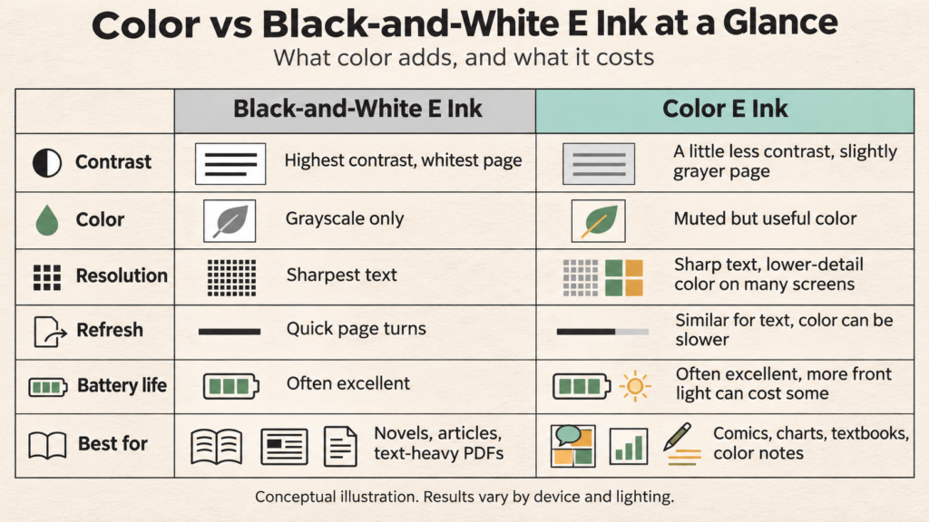
- Color vs Black-and-White E Ink — The Differences at a Glance
- How Black-and-White and Color E Ink Actually Work
- How Color E Ink Evolved — From Triton to Kaleido 4
- Screen Brightness and Contrast — Where Monochrome Still Has an Advantage
- Text Sharpness and Resolution — Is Black-and-White Still Better?
- Color Quality — How Much Do You Actually Gain?
- Refresh Speed, Ghosting, and Responsiveness
- Battery Life — Does Color E Ink Use More Power?
- Reading Comfort and Eye Strain — Is Monochrome Better?
- Color vs Monochrome E Ink for Everyday Activities
- Color vs Black-and-White E Ink — What About the Price?
- Real Devices — What Should Buyers Compare?
- Should You Buy Color or Black-and-White E Ink?
- Will Color E Ink Eventually Replace Black-and-White?
- Common Myths About Color and Monochrome E Ink
- Frequently Asked Questions
- Color vs Black-and-White E Ink — Which Should You Choose?
Color vs Black-and-White E Ink — The Differences at a Glance
Black-and-white E Ink shows black, white, and shades of gray. Color E Ink adds technology that produces color. But not every color screen does it the same way. Kaleido adds a color filter over a black-and-white layer, while Gallery uses colored ink pigments. That’s why some of the trade-offs below are bigger on one than the other.
| Feature | Black-and-White E Ink | Color E Ink |
|---|---|---|
| Primary strength | Text-focused reading | Reading with color information |
| Display appearance | Typically brighter-looking | Often darker, depending on technology |
| Text clarity | Excellent on modern 300 PPI panels | Good, but varies by display architecture |
| Color reproduction | Grayscale only (16 levels of gray) | Limited but useful color |
| Refresh speed | Depends on device | Depends on technology, mode and device |
| Battery life | Often excellent | Also potentially excellent |
| Front lighting | Optional in bright light | Often needed indoors on Kaleido screens |
| Device cost | Wide range | Usually carries a premium |
| Best applications | Novels, articles, text-heavy PDFs | Comics, diagrams, notes, charts |
These are broad tendencies, not rules. Put more simply, here’s the deal you’re making:
- What you gain: color covers, illustrations, charts, maps, color-coded highlights, and color pens for notes.
- What you give up: some background brightness, some contrast, a little text crispness, often some speed, and usually some money.
Color adds functionality, but it doesn’t automatically improve every part of the reading experience.
How Black-and-White and Color E Ink Actually Work
How Traditional Black-and-White E Ink Creates an Image
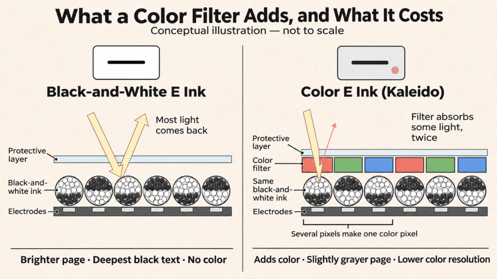
A black-and-white E Ink screen is filled with millions of tiny capsules. Each holds charged black particles and charged white particles. An electrical signal pulls one color to the surface and pushes the other down.
Picture a tray of black and white sand you can rearrange with a magnet from underneath. Bring the white to the top and you get paper. Bring the black up in the shape of letters and you get text. Once the particles are in place, they stay there without power. That’s why a black-and-white e-reader can show a book cover for weeks while switched off. E Ink’s current monochrome screens are sold under the Carta name. If you’re new to all this, start with What Is E Ink Technology? A Beginner’s Guide to Electronic Paper Displays.
How Kaleido Adds Color
Kaleido keeps that black-and-white layer and places a color filter array on top: a thin sheet of tiny red, green, and blue squares. Light passes through the filter, bounces off the white particles below, and comes back colored.
The filter absorbs some light on the way in and again on the way out. So a Kaleido screen reflects less light than a black-and-white one. And because a group of black-and-white pixels makes up one color pixel, color resolution is lower than text resolution.
How Gallery Produces Color Differently
Gallery has no Kaleido-style filter. Each cell holds colored pigment particles: cyan, magenta, yellow, and white on Gallery 3. Carefully timed pulses bring the right ones to the surface.
That avoids the filter’s light loss, but sorting four particle types is more complicated than flipping black and white. Color updates take longer. Gallery also has no black particle, so black is a mix of the other pigments.
Why These Differences Matter
These designs explain almost everything that follows. The filter costs Kaleido brightness and color resolution. The pigments cost Gallery speed and deep blacks. Black-and-white E Ink has neither cost, but also no color. For more detail, see How Do E Ink Displays Work? and our Kaleido vs Gallery comparison.
How Color E Ink Evolved — From Triton to Kaleido 4
Early Color E Ink and Triton
E Ink experimented with color filters and colored pigments as early as 2000, according to its history of color ePaper. Its first commercial color display, Triton, arrived in 2010 and showed 4,096 colors.
A handful of color e-readers used it, such as the jetBook Color and the PocketBook Color Lux. But colors looked pale, the screens were dim, and the devices cost too much. Meanwhile, black-and-white Kindles kept getting better and cheaper. Color stayed a niche.
Kaleido Makes Color E Ink More Practical
The first Kaleido devices shipped in 2020, with color at about 100 PPI. Kaleido Plus (2021) improved the front light and screen construction. Kaleido 3 (2022) raised color resolution from 100 to 150 PPI. When Kobo and Amazon finally launched color e-readers in 2024, both used color filter displays: Kaleido 3 for Kobo, and Amazon’s custom Colorsoft display.
Gallery Takes a Different Approach
Gallery comes from E Ink’s Advanced Color ePaper (ACeP), shown in 2016 and used first in signage. Gallery 3 (2022) brought it to reading and writing devices, most notably reMarkable’s Paper Pro tablets. It’s a separate path, not a successor to Kaleido.
Kaleido 4 — A Meaningful Step Forward?
In October 2026, E Ink announced Kaleido 4 and claimed these gains over Kaleido 3:
- Color gamut volume more than doubled to over 40K
- 15% higher white reflectance
- 50% better contrast
- Video playback at up to 18 frames per second
In practical terms, that’s a brighter page, darker text, and punchier color, which are exactly the areas where color E Ink falls behind black and white. Two cautions apply. The 40K figure is a measure of gamut volume, not 40,000 displayable colors. And these are E Ink’s own numbers. Nobody has measured them independently, and the only announced device so far, the Hanvon M10C II, is aimed at China. For the bigger picture, see Color E Ink Explained and Can Kaleido 4 Make Color E Ink Better Without Turning Up the Light?.
Screen Brightness and Contrast — Where Monochrome Still Has an Advantage
Why Monochrome E Ink Often Looks Whiter
E Ink is reflective. The page you see is the room’s light bouncing back off the white particles. The fewer layers that light has to pass through, the more of it comes back. A black-and-white screen has the simplest stack, so its background looks whiter and its text stands out more sharply.
Why Many Color E Ink Screens Look Gray
On Kaleido, every bit of light passes through the color filter twice. The result is a grayer, darker page. The eBook Reader compared the 2024 Kindle Colorsoft with that year’s Paperwhite and found the Colorsoft’s background darker and the Paperwhite’s blacks deeper, with the gap most obvious with the front light off.
Even Amazon admits it. According to Android Authority, Amazon’s own FAQ says the Colorsoft “sacrifices sharpness and contrast” compared with its traditional e-readers.
Gallery behaves differently. The eBook Reader found Gallery 3’s background darker than black-and-white E Ink but not as dark as Kaleido 3, while its blacks looked less deep.
Can a Front Light Fix the Problem?
Partly. A front light shines across the top of the screen and down onto the ink. That’s different from an LCD backlight, which shines straight at your eyes. Turning it up makes a color screen look brighter.
But there’s a difference between reflectance, how much light the screen itself returns, and front-light brightness, how much light you add. The front light can’t change reflectance. The light it adds still passes through the same filter, and the contrast between text and background stays roughly the same. Amazon’s 2026 Colorsoft upgrade is a good example: much of it concerns a new light guide with nitride LEDs. That’s more light, not a more reflective screen. And more light means more battery use.
Has Kaleido 4 Solved the Brightness Problem?
Not yet, as far as anyone can show. A 15% reflectance gain over Kaleido 3 would help. But E Ink compares it with Kaleido 3, not with black-and-white Carta, and hasn’t published absolute figures. Until someone measures it side by side with a Carta screen, assume monochrome still looks brighter.
Practical Verdict
- Indoors: black and white looks noticeably brighter. A color screen usually needs its front light on.
- Outdoors: both shine in daylight, and the gap shrinks.
- In dim light: you’re reading by the front light anyway, so light quality matters most. Monochrome text still has more contrast.
Text Sharpness and Resolution — Is Black-and-White Still Better?
What Does PPI Actually Mean?
PPI (pixels per inch) measures how many dots make up each inch of the screen. More dots means smoother letter edges. Around 300 PPI, most people can’t see individual pixels at normal reading distance.
Why Kaleido 3 Has 300 PPI Black-and-White but 150 PPI Color
According to E Ink’s Kaleido 3 specifications, black text is drawn at 300 PPI and color at 150 PPI. Black text uses the full black-and-white layer underneath. Color needs a small group of those pixels under red, green, and blue filters. So your black text can still be 300 PPI sharp. Color images and colored text are where you lose detail.
Why Gallery 3 Is Different
E Ink specifies Gallery 3 at 300 PPI for color as well as black and white, because each pixel makes its own color. Finished devices vary, though. reMarkable’s Gallery 3–based Paper Pro runs at 229 PPI.
Does Color E Ink Make Black Text Less Sharp?
A little, even at the same PPI. Pixel density isn’t the same as perceived sharpness. Contrast, extra optical layers, and font rendering all affect how crisp text looks. The eBook Reader said the Colorsoft’s color layer makes the screen “look just a little bit less clear” than the Paperwhite, even though both are 300 PPI. Most people won’t mind in a novel. Some will notice it on every page.
What About Small Fonts and Dense PDFs?
Small fonts are where contrast matters most. Footnotes, academic papers, and technical documents all benefit from the crispest text you can get. Screen size matters even more: a 10.3-inch screen shows a PDF page at a readable size, while a 7-inch screen forces you to zoom.
Practical verdict: for pure text, black-and-white E Ink is still a little sharper. For dense color diagrams, you’ll want a larger screen, whether it’s Kaleido or Gallery.
Color Quality — How Much Do You Actually Gain?
What Color E Ink Does Well
Color E Ink is genuinely useful when color carries information: colored headings, highlighted passages, maps, charts, color-coded notes, textbook diagrams, illustrations, and comics. Telling a red line from a blue line on a graph is impossible in grayscale. On a color screen, it’s easy.
Where Color E Ink Still Falls Short
Colors are muted, and the range of colors is limited (Kaleido 3 shows 4,096). Smooth gradients such as skies and skin tones can look banded or grainy, and fine color detail gets soft. Photos look closer to a newspaper image than a magazine photo.
Kaleido vs Gallery — Why the Colors Look Different
Kaleido’s filter mixes gray into every color, so it looks pastel. Gallery’s pigments produce richer, more print-like color, but with slower updates. In The eBook Reader’s side-by-side test, Gallery 3’s color came out ahead of Kaleido 3, though still behind even a cheap LCD.
Is Color E Ink Good Enough for Comics and Illustrated Books?
The fairest benchmark isn’t an iPad. It’s a printed page. Next to a glossy comic book, color E Ink looks faded. Next to a color newspaper or a cheaply printed paperback, it holds up much better.
Color adds real value for comics, children’s picture books, and cookbooks. It becomes a distraction mainly when you expect vivid color or fine photographic detail. Screen size also matters a lot: a full comic page at 6 or 7 inches is small whatever the screen’s color.
Refresh Speed, Ghosting, and Responsiveness
Why E Ink Screens Refresh Differently From LCDs
An LCD changes its image almost instantly. E Ink has to physically move particles through fluid. That takes time, so page changes are slower and smooth motion is hard.
Does Color E Ink Refresh More Slowly?
It depends on the type.
- Kaleido: text pages turn about as fast as on black and white, but color content can be slower. The eBook Reader found the Colorsoft and Paperwhite equally quick for ordinary books but the Colorsoft slower with color content. Android Authority estimated color slowed page turns “by roughly a third” compared with the Paperwhite.
- Gallery: black-and-white updates are quick (350 ms on Gallery 3), but color takes 0.5 to 1.5 seconds, depending on the mode.
- Software and controllers can matter as much as the display. The eBook Reader found no speed difference between BOOX’s black-and-white Go 7 and its color model, because they share the same hardware.
Why Ghosting Happens
Ghosting is a faint trace of the previous page left behind when some particles don’t fully move. Devices clean it up with occasional full refreshes, the brief flash you see now and then.
Does Color Make Ghosting Worse?
Often a little. The eBook Reader found color screens “show ghosting more than black and white screens” in its BOOX comparison. But waveforms, refresh settings, and how often the device does a full refresh matter more than color alone. For more, see Why Does an E Ink Screen Flash Black? Full Refreshes and Ghosting Explained.
What About Scrolling, Browsing, and Video?
Neither type is great at fast-changing content. Scrolling web pages works on Android E Ink tablets, with some blur. E Ink says Kaleido 4 can reach 18 frames per second. That’s fine for short animations, but well below normal video and in muted color.
Battery Life — Does Color E Ink Use More Power?
Both kinds of E Ink use almost no power to keep a still image on screen. Power goes into page changes, the front light, the processor, Wi-Fi and Bluetooth, the stylus, and apps running in the background.
Color can cost some battery, mostly because color screens rely more on the front light. Amazon rated the 2024 Paperwhite at up to 12 weeks and the 2024 Colorsoft at up to 8 weeks, according to The eBook Reader. But that’s not a law of physics. Kobo’s Clara BW and Clara Colour use the same 1,500 mAh battery, and the difference in use comes down to how you read.
The bigger difference is the type of device. A simple e-reader that only opens books can run for weeks. An Android-based E Ink tablet that runs apps, syncs in the background, and stays connected to Wi-Fi drains much faster, whether its screen is color or not. Compare complete devices and their battery claims, not display technologies.
Reading Comfort and Eye Strain — Is Monochrome Better?
Reading comfort depends on more than the screen: the room’s light, front-light level and warmth, contrast, font size, how long you read, and your own eyes. E Ink also doesn’t flicker the way some LCD backlights can, though page refreshes do flash occasionally.
Is Black-and-White E Ink Easier to Read?
For many people, yes, because of contrast. Darker text on a brighter background takes less effort to read, especially in average indoor light and with small fonts. Readers who need larger, high-contrast text may find monochrome more comfortable.
Does Color E Ink Emit Blue Light?
The screen itself doesn’t. It’s reflective, not an emissive LCD or OLED. But front lights do emit light, including blue wavelengths, on both color and black-and-white devices. Because color screens often need more front light indoors, you may end up using more of it. Warm-light settings reduce the blue. E Ink says its ComfortGaze front light, used with Kaleido 3, reduces blue light further.
Is Either Technology Proven to Be Better for Your Eyes?
No. There’s no solid evidence that color or monochrome E Ink is better for your eyes. Comfort is personal. If you’re unsure, try both in a store under ordinary lighting.
Color vs Monochrome E Ink for Everyday Activities
Reading Novels and Long-Form Articles
Monochrome is the practical choice. Text is the whole point, and black and white gives you the brightest page and crispest letters. Color only shows up in the book cover.
Reading Comics and Graphic Novels
This is where color earns its keep. Western comics are drawn in color, and grayscale throws much of the storytelling away. Expect muted colors, and pick a screen of at least 7 inches, ideally larger.
Reading Manga
Most manga is printed in black and white, so color adds little beyond the occasional color page. A sharp, high-contrast monochrome screen usually serves it better.
Reading Academic Textbooks
Color helps with diagrams, graphs, scientific illustrations, and maps, and with color-coded highlighting. If your textbooks are mostly text, it matters less.
Working With PDFs
Screen size and PDF tools matter most. Color helps with charts and colored markup. Small text favors the higher contrast of black and white. See our guide to the best E Ink tablets for PDFs.
Taking Handwritten Notes
Colored pens make it easier to organize notes: red for to-dos, blue for ideas, highlights for key points. Plenty of people still prefer a monochrome notebook’s simplicity and crisper ink. Stylus response depends on the device, not color.
Drawing and Sketching
Color helps for simple color sketches and diagrams. For serious digital art, a conventional drawing tablet or iPad is still far better. See our guide to the best E Ink tablets for drawing and sketching in 2026.
Professional Work
Reports, charts, slide decks, and color-coded spreadsheets benefit from color. Contracts, meeting notes, and text-heavy documents don’t.
| Activity | Likely better choice | Main reason |
|---|---|---|
| Novels | Monochrome | Text-focused readability |
| Long-form articles | Monochrome | Contrast and simplicity |
| Comics | Color | Illustrations carry the story |
| Manga | Often monochrome | Mostly grayscale artwork |
| Textbooks | Depends on content | Diagrams and charts |
| PDFs | Device-dependent | Screen size and document handling |
| Notes | Depends | Color organization versus simplicity |
| Sketching | Depends | Color needs and software |
| Business reports | Depends | Color-coded information |
The exceptions matter. A manga reader who loves color volumes, or a novel reader who mostly reads illustrated fantasy, might reasonably go the other way.
Color vs Black-and-White E Ink — What About the Price?
Color usually costs more. The display is more complex, and color models are often positioned as premium products.
The clearest way to see the “color tax” is with twin devices, where one company sells nearly the same e-reader in both versions:
- Kobo launched the Clara BW at $130 and the Clara Colour at $150: a $20 difference for the same 6-inch design.
- Amazon launched the 2026 Kindle Paperwhite at $199.99 and the 2026 Kindle Colorsoft at $289.99, both with 16GB: a $90 difference.
Those are launch list prices, and actual prices change. But the gap varies widely by brand.
Outside twin devices, price comparisons get harder. Screen size, stylus support, processing power, software, front lighting, and how a device is marketed often matter more than the screen. A large black-and-white note-taker can cost more than a small color e-reader. Color doesn’t make a device expensive by itself.
When Paying Extra for Color Makes Sense
It makes sense when color carries information you use regularly: comics, illustrated textbooks, charts, maps, or color-coded notes. If you’d use it every week, the premium is easy to justify.
When Color Is an Unnecessary Expense
If you mainly read novels, articles, and text-heavy documents, you’d be paying more for a slightly dimmer, slightly softer page and colored book covers. That money is better spent on a larger screen, more storage, or a good case.
[AFFILIATE OPPORTUNITY A] Not sure whether color is worth the extra cost? Compare current color and monochrome E Ink devices in our guide to the best E Ink tablets in 2026 before deciding.
Real Devices — What Should Buyers Compare?
Monochrome E Ink Devices Worth Considering
The 2026 Kindle Paperwhite is Amazon’s mainstream black-and-white reader, and Amazon says it has its highest Paperwhite contrast yet. Kobo’s Clara BW is a compact 6-inch alternative with library-book support. BOOX’s Go 7 adds Android apps and stylus support. For note-takers, Supernote’s Manta is a well-regarded monochrome writing tablet.
Color E Ink Devices Worth Considering
The 2026 Kindle Colorsoft brings color to Kindle books. Kobo’s Clara Colour and Libra Colour use Kaleido 3. BOOX’s Go Color 7 Gen II and Note Air6 C cover Android reading and larger-screen notes. reMarkable’s Paper Pro uses a Gallery 3–based screen for richer color in handwritten notes.
Why Device Software Matters as Much as the Screen
Two devices with the same screen can feel completely different. The operating system, note-taking tools, PDF handling, cloud sync, app support, refresh tuning, and battery management all shape the experience. A great screen on clumsy software is still a frustrating device.
That’s why twin devices are so useful. When hardware and software match, the screen is the only thing left to compare.
Affiliate disclosure: Einkopedia may earn a commission from qualifying purchases made through links on this page, at no extra cost to you. This doesn’t influence our recommendations.
| Device | Color or monochrome | Display technology | Screen size | Best use | Main drawback | Current price |
|---|---|---|---|---|---|---|
| Kindle Paperwhite (2026) | Monochrome | Black-and-white E Ink | 7 inches | Kindle books, pure reading | No color | Check price on Amazon |
| Kindle Colorsoft (2026) | Color | Amazon custom color filter display | 7 inches | Kindle books with color content | Costs more than its Paperwhite twin | Check price on Amazon |
| Kobo Clara BW | Monochrome | E Ink Carta 1300 | 6 inches | Compact reading, library books | Small for PDFs | Check price on Amazon |
| Kobo Clara Colour | Color | E Ink Kaleido 3 | 6 inches | Compact color reading | Small screen for comics | Check price on Amazon |
| BOOX Go 7 | Monochrome | Black-and-white E Ink, 300 PPI | 7 inches | Android apps, stylus notes | Android adds complexity | Check price on Amazon |
| BOOX Go Color 7 Gen II | Color | E Ink Kaleido 3 | 7 inches | Color reading with Android apps | Darker screen than its monochrome twin | Check price on Amazon |
For Kindle-specific advice, see the Kindle buying guide.
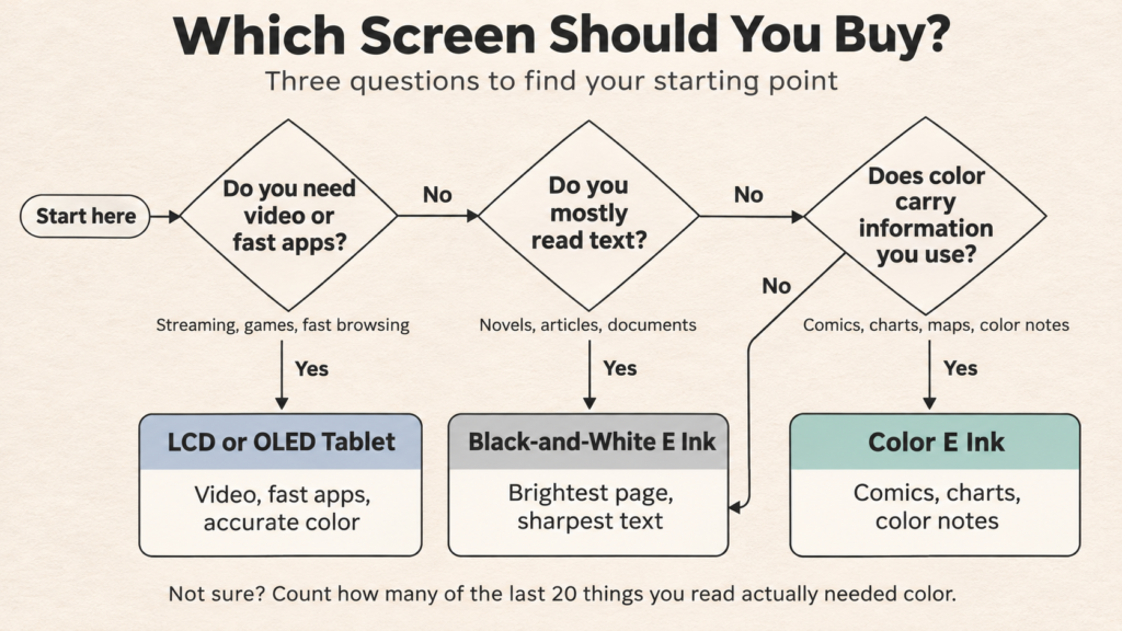
Should You Buy Color or Black-and-White E Ink?
Choose Black-and-White E Ink If…
- You mostly read novels or text-heavy articles.
- Contrast and a bright, clean page matter most to you.
- You want a simple device that just reads books.
- You rarely need color.
Choose Color E Ink If…
- You read illustrated books, comics, or graphic novels.
- You review charts, maps, and diagrams.
- You study from color-rich textbooks.
- You annotate PDFs in color or organize notes with colored highlights.
Consider an LCD or OLED Tablet Instead If…
You want video, fast web browsing, accurate color for photos or design work, digital painting, games, or other fast, interactive apps. No E Ink screen, color or not, does these well.
Five Questions to Ask Before Buying
- What content will I read most often?
- Does that content genuinely need color?
- How important are contrast and a white background to me?
- Do I need fast scrolling or frequent interaction?
- Is the extra cost justified by how I actually read and work?
Here’s a quick way to answer the first two: look at the last 20 things you read. Count how many had color that actually mattered, such as charts, comics, maps, or illustrations, not just a color cover. If it’s only one or two, black and white will probably serve you better. If it’s a third or more, color is likely worth the trade-off.
Know which way you’re leaning? Our buying guides compare the best color and monochrome devices for each kind of reader.
Will Color E Ink Eventually Replace Black-and-White?
What Kaleido 4 Suggests About the Future
E Ink is clearly working on color’s weak spots. Kaleido 4’s claimed gains in reflectance, contrast, and color target exactly what black and white still does better. If they hold up, the gap will narrow.
What Still Needs to Improve
Color E Ink still needs better reflectance, stronger contrast, richer color, faster refresh, lower manufacturing costs, and wider device availability, especially for Kaleido 4.
Why Monochrome E Ink May Remain Relevant
Black and white has a structural advantage: it needs no filter and no colored pigments, so nothing sits between the ink and your eyes. As long as adding color costs any brightness or contrast, a screen built only for black text on a light page will stay the best tool for that job. Color may become the default on some devices, but don’t expect black and white to disappear.
Common Myths About Color and Monochrome E Ink
Myth: Color E Ink is always better because it’s newer. Reality: It’s better for color content and usually a little worse for plain text.
Myth: Monochrome E Ink is becoming obsolete. Reality: Amazon, Kobo, and BOOX all released new black-and-white models in recent years, including the 2026 Paperwhite.
Myth: All color E Ink has lower resolution. Reality: Kaleido 3 shows text at 300 PPI and color at 150 PPI. Gallery 3 is specified at 300 PPI for color.
Myth: Color E Ink always uses more battery. Reality: The front light, processor, and apps usually matter more.
Myth: Color E Ink is the same as an LCD. Reality: It’s reflective, holds an image without power, and doesn’t shine light at your eyes.
Myth: Monochrome E Ink can’t display images. Reality: It shows 16 levels of gray, which is fine for photos, manga, and illustrations in grayscale.
Myth: Color E Ink is automatically better for studying. Reality: Only if your study material uses color. Text-heavy reading favors monochrome.
Frequently Asked Questions
Is Color E Ink Better Than Black-and-White E Ink?
Not overall. Color is better for comics, charts, and illustrations. Black and white is better for text: brighter, sharper, and usually cheaper.
Is Color E Ink Worth the Extra Money?
Yes, if you regularly read content where color carries information. No, if you mostly read novels and articles.
Why Does Color E Ink Look Darker?
On Kaleido screens, a color filter absorbs some of the light that would bounce back. Gallery screens avoid the filter but have weaker blacks.
Is Color E Ink Less Sharp Than Monochrome?
Slightly, for text. Kaleido 3 keeps 300 PPI for black text, but its color layer reduces contrast. Color images are 150 PPI.
Does Color E Ink Use More Battery?
Sometimes, mostly because of greater front-light use. The device’s processor, software, and connectivity usually matter more.
Is Color E Ink Better for the Eyes?
There’s no evidence either type is better for your eyes. Many people find monochrome’s higher contrast easier to read.
Is Color E Ink Good for Reading Novels?
It’s perfectly usable, but you’d be paying extra for a slightly dimmer page with little benefit.
Is Color E Ink Good for Manga?
Mostly no. Manga is largely black and white, so a high-contrast monochrome screen serves it better.
Which Is Better for PDFs?
Choose by screen size and software first. Color helps with charts. Monochrome helps with small text.
Is Kaleido 4 Better Than Monochrome Carta?
We don’t know. E Ink compares Kaleido 4 with Kaleido 3, not with Carta, and there’s no independent testing yet.
Can Color E Ink Display Videos?
Technically, yes, at low frame rates. In practice, motion is choppy and colors are muted.
Will Color E Ink Replace Black-and-White E Ink?
Not soon. As long as color costs brightness and contrast, monochrome will remain the better choice for pure reading.
Color vs Black-and-White E Ink — Which Should You Choose?
So, does adding color make an E Ink screen better? Sometimes. Color genuinely helps when information depends on it: comics, diagrams, maps, and color-coded notes. For text, black and white is still the better screen: brighter, crisper, simpler, and usually cheaper.
Neither is the newer, better version of the other. Reflectance, clarity, responsiveness, and software often matter more than color alone. The right choice depends on what you read and how you work.
Color E Ink makes electronic paper more versatile. Black-and-white E Ink keeps it beautifully focused. Neither is automatically the better technology. The smarter choice is the one that improves what you actually do on the screen.
Still deciding which E Ink device to buy? Explore Einkopedia’s latest buying guides to compare color and monochrome e-readers and digital notebooks.